I’ll be honest — I wasn’t someone who believed a single lampshade could do much. For years my living room was a study in polite beige. Lovely in photos, a bit dull to actually sit in. Then one rainy Sunday, mostly out of boredom, I swapped the cream drum shade on my side lamp for an orange one. And the room, genuinely, changed character overnight.
The Evening I Gave Up on Neutrals
It wasn’t a planned revamp. I’d been scrolling through orange lampshades on a whim, half-convinced I’d send whatever I ordered straight back. The one that won me over was the Zigzag 20cm Tapered Lampshade in apricot — a warm, slightly dusty orange with a chevron pattern that felt playful without being loud. I put it on the lamp next to the sofa, clicked the bulb on, and sat down properly to look at it. The whole corner softened. My husband walked in, stopped, and asked what I’d done to the room. That was the moment I realised I’d been underestimating lighting my whole life.
What Orange Actually Does to a Space
There’s something about orange that tricks the brain into thinking a room is warmer than it is. Literally. The glow it throws has this toasted, late-afternoon quality — even at nine o’clock on a miserable February evening. It softens edges, flatters skin tones (which I didn’t expect to notice, but do), and somehow makes a sofa look more inviting. It’s less about decoration and more about mood. Beige lights a room. Orange warms it.
The One That Nearly Didn’t Make the Cut
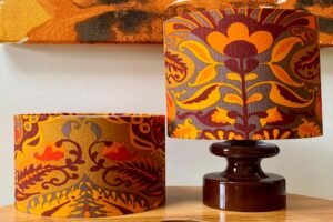
A few weeks later I got braver and ordered the AARTIN 45cm Autumn Leaves Cotton Lampshade in a straight empire shape for the floor lamp in the reading corner. Bigger, bolder, with leaves printed across a terracotta base. I hesitated for a week before putting it on. But it’s become my favourite thing in the room. The pattern throws the loveliest shadows onto the wall behind it when the lamp’s on — it almost feels like candlelight.
Why I Still Keep a Blue Patterned Lampshade Nearby
Now, this might sound contradictory, but I haven’t gone fully orange. On the bedside table I kept a blue patterned lampshade — something I’d bought ages ago — and weirdly, the two colours work together. Orange and blue are complementary on the colour wheel, which I vaguely remembered from school, and it turns out it’s true in real life too. The blue grounds the warmth. Without it, the room would tip into cosy-but-too-much. With it, there’s balance.
The Detail I Wish Someone Had Told Me
If you’re thinking about trying this — get the bulb right. A cool white bulb underneath an orange shade ruins the whole point. Warm white, always. And size up slightly; a timid shade on a decent lamp base looks apologetic.
Would I Do It Again?
In a heartbeat. The Ripple in Coral Pink and the Ikat 40cm tapered are both on my wishlist now. Turns out one orange lampshade was never going to be enough.